At CommsBox, Friday is playday, whenever we can get away with it. So last Friday we set ourselves the challenge of giving an old non-responsive website an overnight facelift. Like all good stories, let's start at the end and work our way back. This is the result of "Playday Friday" - how the Radical Thinking web site was given a responsive makeover in 24 hours.
The design of the Radical Thinking website hasn't been touched in over 5 years and was looking terribly tired and, more importantly, wasn't responsive. It's a common problem, we are all so busy running our businesses and looking after our clients that our own web sites can get a little neglected. Many companies are finding the same. Their websites were designed at a time when pretty much everyone viewed a website on a fixed screen - either a laptop or a PC.
The advent of greater smartphone and tablet usage brought about the responsive design era. If you're not familiar with the term, responsive design simply means that your website looks different depending on the device on which it's being viewed.
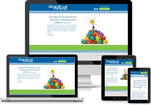
We're pretty pleased with the results - the key message is both visible and, more importantly, readable on all the key device platforms in use today.
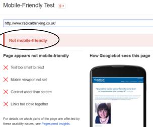
Let's step back to Friday morning and our starting position. While looking a little dated, the Radical Thinking site worked well on desktop and laptop devices. Smaller devices were more of a struggle though. You can see in the screen grab from Google's Mobile Friendly Test tool just how much work we had to do.
Google's verdict was pretty damning - this site wasn't going to rank at all well in the search engines for anyone using a mobile device and quite rightly so. If anyone persevered and found the site they'd pretty quickly tire of the finger gymnastics required to actually read the content. It needs to change!
So what did we do?
Step 1 - Decide on what Design Features to keep for consistency
We decided to keep:
- The logo
- The basic colour scheme
- Much of the copy
- The menu structure
Step 2 - Decide on some basic Design Themes that would lift the look and feel
Stock photography is a blessing for saving time and money. It's important though to choose a theme and stick with it. We purchased the photography from 123rf (there are plenty of other stock photography sites out there). For as little as a couple of pounds per picture you get a professional look to your facelift.
When you start to search for images think about what, metaphorically, represents your brand. In this instance searching for "lightbulb" instead of management consultancy. We chose the crumpled up paper and lightbulb to reflect the notion of lots of ideas, discarding the less good ones and then having a lightbulb moment when you've struck gold. The imagery tells the story of the brand without having to use so many words.
Once you settle on a design theme that you like look for images from the same photographer, in this case Alphaspirit. As you develop your content marketing you'll want your articles to have a consistent look and feel. You don't need to stick with the same photographer, you can just keep with a feel and colour range. Choosing a theme with a number of colours will allow you to add your own photography, for example when you visit an exhibition, without clashing with your overall design. Try and make your colours and theme match what you want people to think of you. In this case the Radical Thinking brand is light in spirit, yet professional. We added a bright green to the home page to give it a lift.
Step 3 - Build responsive design templates in Commsbox
So now the words and images are chosen, it's time for us to build this into a set of responsive templates. For this site we've created three templates: one for general copy pages; one for the blog summary page and one to show the blog articles themselves. Many sites would also have a separate home page template, but in this case we didn't feel that was necessary.
The layout needs to be considered across the range of devices and screen sizes commonly in use these days, from large office desktops to mobile phones. Regardless of the device, keeping key messages before the fold is an important concept, one unfortunately ignored by many sites. Capture your audience's attention without them having to scroll. On large screens we can afford a larger banner area and list of menu links encouraging further site exploration. Leaving things unchanged on a smaller device means the user may see nothing other than the banner - not very enlightening!
Changes we decide to make for small screens in the template:
- Reduce the size of the banner area:
- The menu collapses to a single menu 'button' which expands the menu when requested
- The logo is reduced in size and moved to the space freed by the collapsed menu
- Likewise the social media buttons are moved to the menu bar to make room for a simple phone number and smaller 'Call to Action' button.
- Reduce the size of the title. An attention grabbing big title on a big screan is great, but the same on a small screen means the visitor doesn't see enough of the copy
- Collapse from two columns to one - placing the second beneath the first
- Reduce image sizes so they are still completely visible within the screen width available.
- Reduce some of the white space between elements.
One very fashionable approach seen on many sites is to have a large image or slide show at the top of the page that spans the whole width. At the moment we're not favouring this approach because one large image can take a long time to download, will affect your SEO ratings and potentially pushes your key messages below the fold on smaller devices.
You can get a similar responsive effect using Wordpress or Bootstrap templates that look really pretty. However, you have to make sure that you use a designer who has the right technical knowledge to implement your website, or you could easily suffer from slow download times. Website design must both look good and perform well for visitors and search engines. We design templates that are pretty, download superfast, are responsive for different devices, contain the marketing automation, blogging and email marketing tools you need to get your site to really perform.
Step 4 - Copy over the content
Once the new template is live it is time to copy the content across. This is mostly a simple cut and paste job from old website to new. It still requires some thought though when the content includes images - they may need to be resized or need to be made responsive. Some images may be primarily for decoration and you may want to remove these entirely for mobile viewers. Just because you are having a facelift doesn't necessarily mean you need to lose all the effort you put into writing your copy.
Step 5 - Blogging, Email Marketing and Marketing Automation
For our clients now is the time that they take over, either using their in-house digital marketing resources or working with digital agencies to create live, relevant, search engine friendly copy and delivering landing pages to capture leads. Adding articles to a site regularly will greatly enhance the organic search engine ranking of the site and give reasons for visitors to keep coming back. Email addresses can be captured from online and offline marketing activities into the CRM system. Then that data is used for email marketing campaigns and personalised marketing automation campaigns, which is when the fun really starts!
 The result...
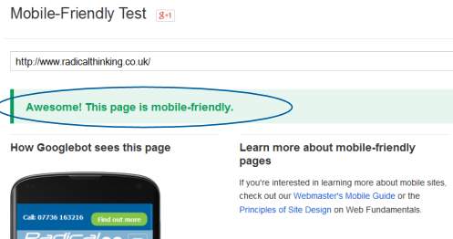
That you can see for yourself by visiting the finished product. Equally important though is what Google thinks of our makeover. The Google Mobile-Friendly Test tool now gives the revised Radical Thinking site a great big thumbs up. It is now, apparently, 'Awesome'!
If you'd like to know how we can help you drag your web site out of the noughties and drop it into the current decade then...
 Peter is the chief architect for the CommsBox™ Integrated Marketing Platform. With over 30 years experience in a variety of R&D and IT positions Peter has worked for both large multi-national organisations and small technology start-ups. Peter founded YellowHawk in 2002 to bring Enterprise class web-applications to the SME market.